Introduction
With the Experiment result screen, you can see the results of the models you have created. Make your model results more meaningful with multiple displays on this result screen.
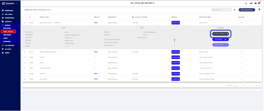
You can see the models you created by clicking on the Model result in the left menu. After clicking on the model you want to see your results, You can access your model results by clicking on “ML PIPELINE RESULT” button.
Experiment Result for Classification Models
EXPLANIBLE AI MODULES
- Decision Tree
- Sunburst
- Classification Report
- Feature İmportance
- Feature Dependency
- Lift Analysis
- Confusion Matrix
- Decision Plot
- Detailed Metrics
- Leaderboard
- Compare Models
Experiment Result - Decision Tree
Decision trees explain the model's decision judgment by converting the results of the data distribution learned by modeling into simple rule sets. Thus, you can find out which situations are for or against your business model by following the rule sets.
So, what do B2Metric decision trees tell you?
The Decision Tree is interpreted by following tree paths that reach nodes that separate the target class in a highly purely manner. To reach pure nodes, we find the nodes with the highest rate differences in bars.
- Colors are used to indicate the density of classes.
- B2M Main Node tells you what percentage of your target audience belongs to which class in the classification problem and how many instances your data set consists of.
- B2M Child Node displays the density of target classes at a particular node in the decision tree by providing a horizontal bar colored by target classes
Experiment Result - Sunburst
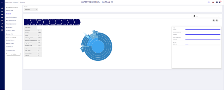
Sunburst shows hierarchy through a series of rings, that is sliced for each category node. Each ring corresponds to a level in the hierarchy, with the central circle representing the root node and the hierarchy moving outwards from it. Rings are sliced up and divided based on their hierarchical relationship to the parent slice. The angle of each slice is either divided equally under its parent node or can be made proportional to a value. Colour can be used to highlight hierarchical groupings or specific categories.
Experiment Result - Classification Report
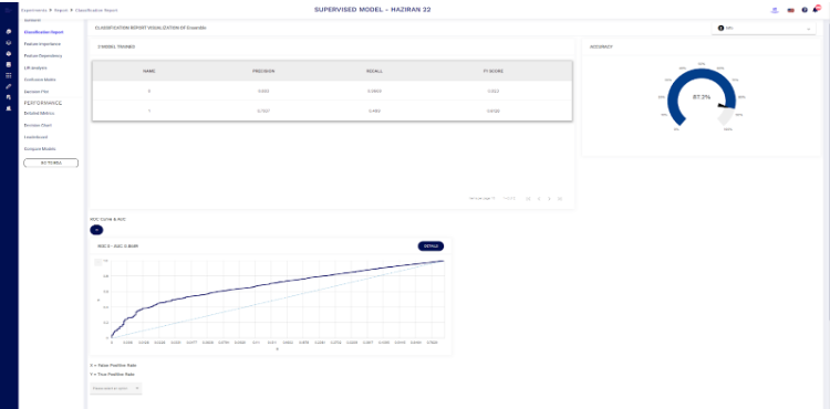
If the problem formulation is to classify data into two or more classes, we can explain model performance with a number of scores. With a simple logic, we want the model we have developed to estimate a high number of target audiences and to make the estimates correct. We explain the validity of this definition for the model by estimating the performance of the model in the test set.
Experiment Result - Feature Importance
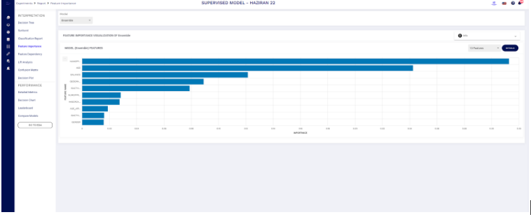
Choosing the appropriate features for the model is one of the most important things for a correct model. Feature importance is also a demonstration that gives us an idea for suitable feature selections. We can read the relationship between the selected target and the features. By choosing the right features, we can get much higher scores and make better predictions. It also gives us the idea of making changes to our data by seeing the values on the Feature importance screen. And by interpreting these representations, we can remove irrelevant features from our model.
The feature importance list is the list of variables that affect the results of this model, which best describes the underlying meaning of the data. By looking at the variables in this list, we can classify, prioritize and interpret the factors that affect our business cycle.
Experiment Result - Feature Dependecy
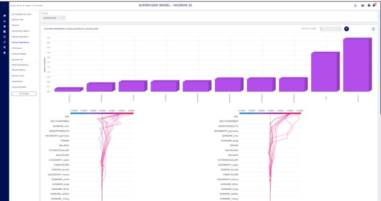
Feature dependency shows the list of variables that affect model decisions. SHAP values are a convenient, (mostly) model-agnostic method of explaining a model’s output, or a feature’s impact on a model’s output. It provides a means to estimate and demonstrate how each feature’s contribution influences the model.
Experiment Result - Shapley Importance
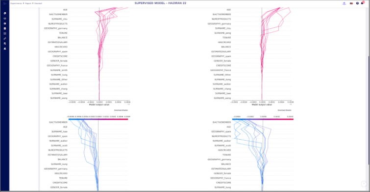
Shapley Importance briefly describes how much each property contributes to the estimate for the estimated value.
For example, let's say that a municipal institution wants to build a metro line. The parameters that are important for the establishment of this line are "whether there are other subways around", "human population in that area", "cost of establishing a subway line there" and "traffic density in that area". Let's predict whether the subway will be built or not in the model. When we do predictive modeling, we can read which feature contributes positively or negatively to our model with the Shapley Importance graph.
Experiment Result - Lift Analysis
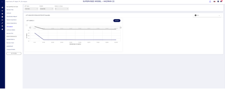
As an example, Lift analysis allows you to read situations such as the acceptance rate of a campaign, the likelihood that the customer will be lost, or whether a credit customer will receive a loan in the future by examining their past credit status.The Lift value of an association rule is the ratio of the confidence of the rule and the expected confidence of the rule. The expected confidence of a rule is defined as the product of the support values of the ruling body and the rule head divided by the support of the ruling body. the confidence value is defined as the ratio of the support of the joined rule body and rule head divided by the support of the ruling body.
Experiment Result - Confusion Matrix
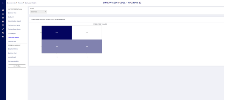
A confusion matrix is a table that is often used to describe the performance of a classification model (or "classifier") on a set of test data for which the true values are known. The confusion matrix itself is relatively simple to understand, but the related terminology can be confusing. Let's understand TP, FP, FN, and TN in terms of pregnancy analogy.
Experiment Result - Decision Plot
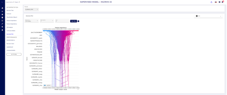
A decision surface plot is a powerful tool for understanding how a given model "sees" the prediction task. It also explains how the model has decided on a specific data segment. For example, the given plot shows the model decision for CUSTOMERID >=23 data segment.
Experiment Result - Detailed Metrics
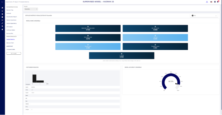
Can see our metric scores based on the model on the detailed metrics screen. About our Target column type, the number of rows, minimum and maximum value, standard deviation and number of unique values, etc. we can read information.
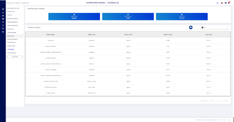
Experiment Result - Leaderboard
On the Leaderboard screen, you can read the values generated by the algorithms in the performance metric type you selected when training your model. You can see the training times.
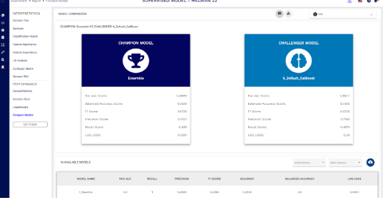
Experiment Result - Compare Models
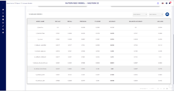
The algorithm that gives the best result for your model is called "Champion model" and the algorithm that scores the most successful after that is called "Challenger model". Here you can see the success scores of these models according to metric types.
On the Leaderboard screen, you can read the values generated by the algorithms in the performance metric type you selected when training your model. You can see the training times.
Experiment Result for Regression Models
EXPLANIBLE AI MODULES
- Feature İmportance
- Feature Dependency
- Decision Plot
- Regression Metrics
- Detailed Metrics
- Error Distribution
- Leaderboard
- Compare Models
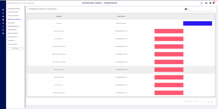
Experiment Result - Regression Coefficient
The regression coefficients are a statistical measure that is used to measure the average functional relationship between variables. Also, it measures the degree of dependence of one variable on the other(s).
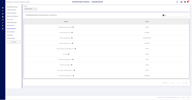
Experiment Result - Regression Metrics
We see the success scores of the regression model based on metrics on this screen. It helps you to understand the performance of your model. These calculations are calculated from real data, calculated distances to the predicted value, and then calculated by putting them into mathematical processing.
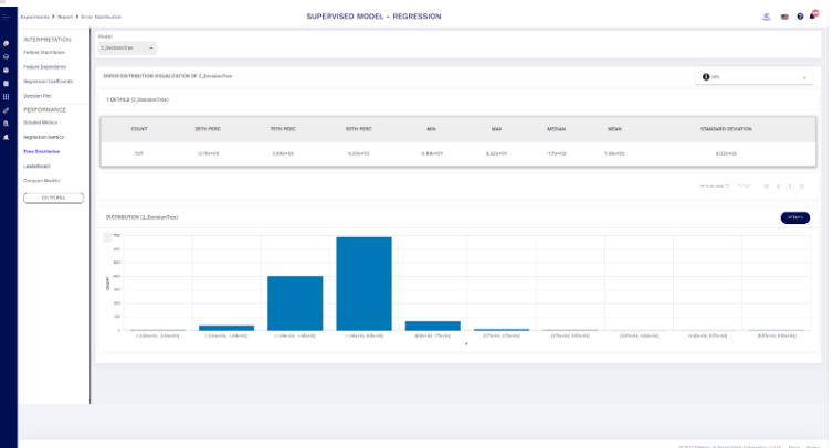
Experiment Result - Error Distribution
The error distribution is a probability distribution that shows how likely each error delta is.
Experiment for Unsupervised Models
EXPLANIBLE AI MODULES
- Histogram
- 2D Scatter Plot by Cluster
- 3D Scatter Plot by Cluster
- 3D PCA Results
- 2D PCA Results
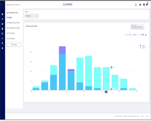
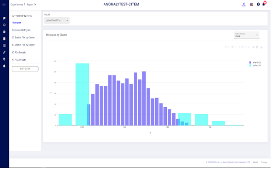
Experiment Result - Histogram
Depending on the model and variable result you have selected, you can see the histogram of the features based on clusters & outliers.
Experiment Result - Scatter Plots
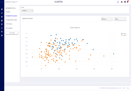
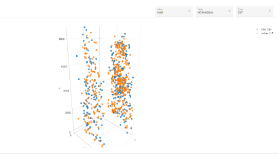
You can examine 2D and 3D scatter plots for the clustering and anomaly models. Axis of this plot represents features that you choose.
Experiment Result - PCA Results
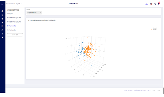
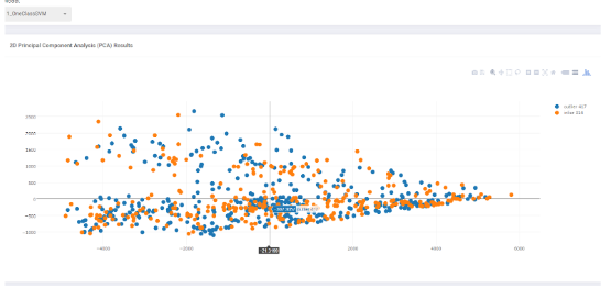
You can examine 2D and 3D PCA results for the clustering and anomaly models. Axis of this plot represents features that you choose.
